Our Approach and Experiences In Creating Design Systems


We’ve created design systems for both enterprise-size clients and smaller companies- our approach and process is based on our experiences and the issues we’ve encountered so far. Design systems have been quite a popular topic recently, and when it comes to their creation and development, no global standards have been established yet.
This is why we want to show how we approach this subject.
In this blog post we’d like to share some insights into creating design systems. You will learn how to:
- Start building a Design System
- Build design library assets
- Structure documentation
It takes two (and more) to tango
Setting up the right team is crucial.
On one hand, we need someone with UX skills; on the other hand, we also need a more UI-savvy designer. Obviously, we could find a unicorn with expertise in both fields, but she or he would quickly become a bottleneck as such projects are complex.
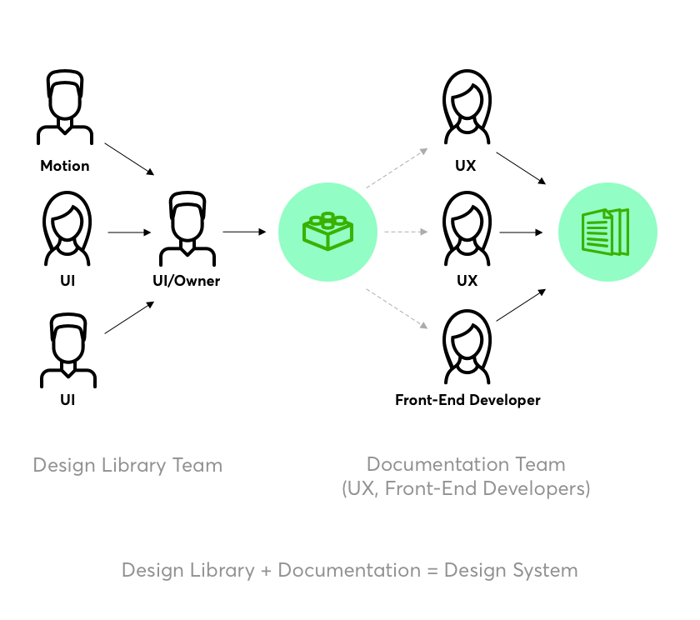
A design system consists of a few elements:
- A design library- which is a repository of UI elements.
- Documentation- which is linked with the design library. The documentation often contains some code snippets of design components, which makes a major difference compared to static style guides.
To create a design system you need at least one designer and one developer, but, as we mentioned above, it might be inefficient. The task will take too much time and will be exhausting for just two people.
The more people you can involve in the creation of the design system the better the outcome.
An optimally sized team, based on the projects we have completed, should consist of five people. Breaking that number down, you need four product designers with different expertise (2x UI, 2x UX) and a developer. The ratio is now four-to-one. This number could be scaled up, so for more complex design systems, you can have eight designers (e.g. with illustration and animation included) and two developers.
For an example of an advanced design system we can look at the one used by Atlassian.
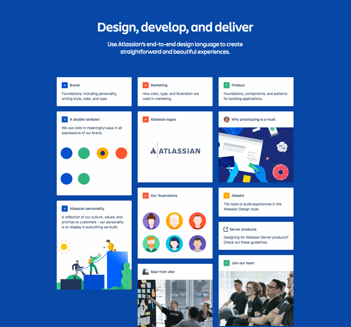
Atlassian Design System
They have covered every area of their products from:
- Colors
- Illustrations
- Components
Having plenty of products in a portfolio like this requires unified guidelines. Core design elements are now much easier to access and stay consistent throughout products.
We hope you now understand why a business benefits from having a design system.
Choosing the right team model
Making sure that you gather the right people for your mission should be your first step and it is not only important to work with experienced developers and designers. There should also be a design system coordinator, who directs and overlooks the project, as well as a person that has a sense of the brands’ identity, mission and goals and can check if the other team members include them in the design.
Even though there could be a difference in work practices and conflict of interests between the teammates (especially in the context of an often non-uniform approach between developers and designers) - keep in mind that having a variety of perspectives can be utilised in a productive way. It will make the final product even more versatile and exceptionally applicable.
A design library team should consist of specialists in areas such as user interface, illustration, and motion design.
A documentation team should be made up of designers who have expertise in user experience, research, as well as front-end developers who excel at codifying design components.
During our trial and error period we struggled because our design library was often broken due to synchronization issues.
We recommend choosing one person who will be responsible for updating the master library file (the library owner). In other words, one designer should aggregate all the approved design components from the rest of the team and merge them into the design library file. It allows the team to have a better version control over the library.
Make one person responsible for keeping everything in check- it will reduce the information creep because the rest of the team will know that the repository has only one owner. The rest of the team should inform the library owner about their needs and issues regarding the component library.
We keep a master library file on Google Drive and have Sketch linked to that library. It works well for us now- but it didn’t when more than one designer was allowed to make changes. This team model is called“solitary”.
The meaning of language
Although it is understood that the workload should be divided amongst respective staff, the efficacy in realisation will come into fruition only if there is a clear vision that unifies all of the particular segments of the design. The factor that truly brings together the entire development is the mutual visual language that translates through the entire project - as the author of the design systems book states “Language is fundamental to collaboration.
If your work in a team, your design language needs to be shared among the people involved in the creation of the product”[Alla Kholomatova-‘ Design Systems’- Smashing Magazine]. Consequently the elements that should be considered crucial to keep in a consistent alignment in order to deliver a harmonious message are: colour, typography, iconography, motion and space.
These components are especially significant when it comes to branding. Therefore, design systems should be created in a way that somehow manages to offer customization that reflects brand identity within a ready-to-use systematized set of mock-ups.
How to get started
Once you’ve found the right team for the task it’s time to kick the project off!
As needs vary from company to company, we assume that you’ve already built at least one digital product. The first thing we recommend doing is listing all elements that need to be included in the design system. You can use post-it cards and a whiteboard or use a worksheet like us:
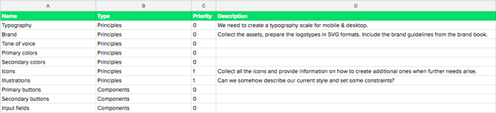
An excerpt from the inventory
Then you need to prioritize the items based on usage.
At Netguru we assign priority points from 0 (mandatory) to 3 (superfluous).
You can also use the worksheet from Nathan Curtis’ article on medium.
How to prioritize the components
To avoid the risk of feeling overwhelmed the next stage of the designing process should be identifying actual categories of the system which may include among others: visual language, UI elements, components and patterns as well as templates and layouts. To make things easier you can break them down into smaller particles and let your team choose the most important ones in their eyes.
Every component that interacts with the user should be thoroughly examined. For example, we may have password input fields (which require multilevel validation), standard fields, text areas, PIN prompts, and so on. Each of them should receive a lot of attention in terms of visuals, behavior, usage, and anatomy.
This is the only way to keep components consistent and to get a successful product as a result. The difference between 'good' and 'great' lies in the details.
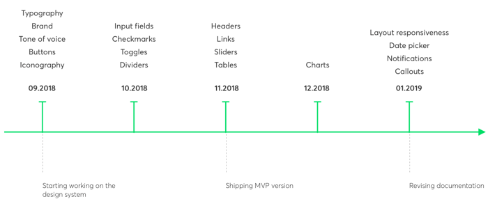
Once you’ve created a list of the components and prioritized them you can allocate the items to relevant sprints. Coming to a clear conclusion about priorities should be the end goal of the group deliberation and negotiation.
Depending on the team’s size an example roadmap could look like this:
At the same time, another designer can start building up or simply collecting the product principles or visual language elements such as brand guidelines, colors, typography and grid.
Let’s take the grid for example- in our opinion, introducing grid units at the beginning speeds up the design process later on. For example, while designing for mobile it is recommended that you lay out designs on 8px grid.
As a result, we can assume that 1 grid unit (gu) = 8px. One of its benefits is the spacing consistency and scalability across various device sizes. Let alone the rhythm, which comes along as an extra bonus for using the grid properly.
Ideally, another designer could simultaneously start establishing documentation templates for describing the elements. The template should include arrows, lines, rulers, numbers, and captions which are used later on for creating the documentation.
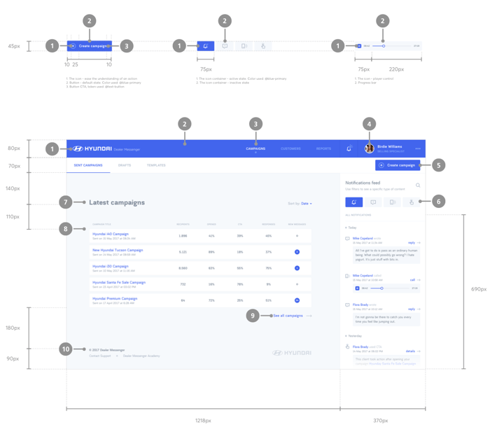
An excerpt from the documentation: anatomy of the components and layout
As the design system is getting bigger, it’s easy to fall into the trap of having inconsistent documentation. One of the main goals of having a design system is to reduce inconsistencies in the company’s digital products because an inconsistent design system is useless.
To avoid inconsistencies establish one standard process for uploading graphics and screenshots to the documentation, along with the documentation template.
For example- all visual examples should be exported at @2x, have the same margins, and be properly named. Also, remember to keep all assets in one place (we use Google Drive) in case someone new on the team needs access.
Putting it all together
As we initially stated, a design system is a combination of a pattern library and documentation. You should end up having a design library with all the components placed in the file. A pattern library is the final outcome of the work done by the design library team.
.png?width=700&name=Shopify%E2%80%99s%20Design%20System%20%E2%80%94%20Polaris%20(Design%20Library%20in%20a%20Sketch%20file).png)
Shopify’s Design System — Polaris (Design Library in a Sketch file)
Once the components have been designed the documentation team will be able to create the necessary descriptions and provide the anatomy of the components (e.g. margins, height, width).
The structure depends on the end platform of the product. If a product is served for both desktop and mobile, then some rules for breakpoints and viewports should also be covered.
An example table of contents for each component and pattern looks as follows:
Description
Specification
Anatomy
- Element name
- Element name
Behaviour
Qualities
Measurements
Usage (worth having some animated examples)
Code snippets
Dos & Don’ts
Further maintenance
To keep track of our progress we use a Kanban board and work in biweekly sprints.
The rest is aligned with the Agile approach: we have status calls on a daily basis where we inform each other what was done the previous day, what our plan for today is, and what the potential blockers are.
Once every two weeks we conduct a thorough review and go through all the new and revised components one by one. The entire team is present at these calls because everyone somehow contributes- the roadmap created acts as a guide. Some elements could be on their second or even third iteration, because of new issues will arise during development. That’s normal! A product design process is never finished.
As design systems are living “beings” they are never really “done".
Don't forget about content
If we all agree that design systems are supposed to be a reusable frame that can be adhered to diversified needs, during the process of building these systems we should take into consideration that they eventually will be filled with content and that they need to be effortlessly utilised despite contents diversification.
The utility of the given arrangement should not be compromised despite the change of the contents’ character and its message both in a sense of topical difference as well as type (short text, long article, photo, video etc.). At the same time it should offer an appropriate exposure to all of the categories above.
In conclusion, since design systems are a remarkably valuable, convenient and highly practiced tool of building online interfaces in a standardized and automated way with multitude of indisputable advantages, making sure that the process of their production is as high of a quality as possible should be a significant objective. It is especially crucial also because their utilisation through expediting workload by applying modularity, can multiply operating capacity and accelerate business opportunities, thus directly influence profitability.
And about the people
Some experts are convinced that design systems can be approached with the atomic design methodology, where we are looking at them solely as the building blocks of various scale and level - what seems like a very attractive and simplified vision.
Others claim that design systems are not only cut out, ready-made modules that you can automatically apply to any webpage without further analysis. Even though they are created to be expanded, effortlessly applicable and adjustable, at the end of the day, the people who are involved should always be the centre of the attention. That includes potential website owners - their objectives, expectations and needs, as well as obviously hypothetical users along with their motivations, goals and predicted behaviour.
Answering those burning questions can smoothly lead us to the way that the system should be designed - which components are non-negotiable, what should be their hierarchy, placement and arrangement. Furthermore, by predicting the potential path and the steps that the user would need to partake in and by creating theoretical settings and scenarios, we can have a clear understanding of the system organisation and character.
Key takeaways
- A Design System consists of two components: a design elements library and documentation.
- Start by listing down all the elements that need to be included in the design system.
- Prioritize elements by usage and allocate items for the first sprint.
- Start with visual language: colors, typography, and grid.
- Introduce grid units (for example while designing for mobile 8px = 1gu).
- Create templates that will describe the elements (arrows, lines, rulers, numbers, captions).
- Set up one standard process for uploading graphics and screenshots for documentation.
- Keep source files of graphics and screenshots from the documentation available to everyone.
- Select one person who will be responsible for updating the master library file (a design library owner).
- The rest of the team can contribute to the library but they need to contact the library owner first.
- The rest of the team should inform the library owner about their needs and issues regarding the components library.
- Keep the master library file on Google Drive and link that library with Sketch.
- Make backups and keep track of file versions.
- Track progress by using a Google sheet, Jira or other tracking software.
- Have daily meetings where you update each other on what was done the previous day, what is going to be done, and what the potential blockers are.
- Create a structure for documentation.
- Keep a changelog of the master library.
- Communicate frequently with stakeholders and keep everyone on the project in the loop.
- Create a note on a Slack channel with all the important information and links (to the library, to the UIs, and so on).
Design Systems can be quite a challenging endeavor and require experienced people in order to deliver high quality and usable outputs.
The goal is to have a library of reusable components followed by clear standards so that designers and developers can build coherent digital products.
Remember- your design system will constantly evolve, change and need updating but this will still be quicker than explaining the whole thing from start to finish to someone new.
Served as a single source of truth available to everyone in the company, a Design System allows employees to be on the same page and stay in the loop.


.jpg?width=384&height=202&name=10%20Tips%20for%20Stunning%20%20Dark%20Mode%20Design%20(1).jpg)


.jpg?width=384&height=202&name=Orbem%20website%20on%20a%20laptop%20(1).jpg)


