How to Make Sketch Even Better?


It is the first design tool created with the intent to satisfy the sublime needs of product designers. Many times, Sketch was such a nice surprise that I was amazed how intuitive it is.
I like Sketch because of the flexibility it affords its users. We can use our own plugins, set our own shortcuts and create a workflow that suits us best. As a nerdy keyboard-shortcut junkie, I feel at home with Sketch. There are a lot of operations that we can do with keyboard shortcuts. I personally love to use Runner (by typing commands I can feel like a hacker ⌨️).
Despite all the magnificence of Sketch, there is still some room for improvement. Below you can see my personal wishlist of features:
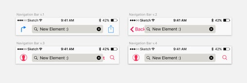
1. Let us choose the colors for the symbols
Symbol overrides were a game changer in Sketch’s workflow.
Back in the old days, we needed to create a separate version of every symbol instance. Basically, the role of a symbol was limited to a very simple element like a single state icon or a button.
For example, if we needed an iOS tab bar, then we needed to have multiple versions of every state of the button. If we had 5 tabs, then we needed to have at least 5 symbols for that. If we wanted to show different “notifications” for every element and every screen, then we needed to create separate versions of the symbols with the notifications. By and large, every other “state” of the symbol would force you to create a completely new, dedicated symbol.
Now, we can build more and more complex symbols that contain even more flexible elements. We can juggle the instances in the elements, swap icons, elements, statuses, notifications, etc., which makes it so much more flexible. Finally, we can almost take full advantage of the symbols potential! Almost…
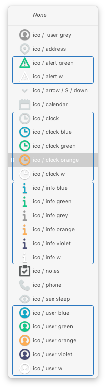
Problem:
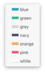
To override the states or simply use different colors of the same icons, we need to create multiple versions of that same icon only with a different fill color… I have a feeling that this should be sorted out differently.
Proposed solution (basic):
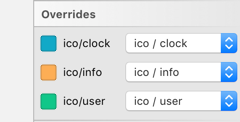
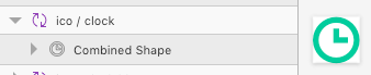
We can approach this problem in the same way as the text layers are treated in symbols. They are editable. So this lets us simply choose the fill color.
Proposed solution (advanced):
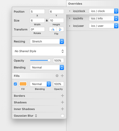
As you can see here, we can go even further and open more options for the non-destructive edition of an in-symbol symbol element (I feel that we need a broader terminology here, by the way). In this model, the beginning of the axis of the nested symbol is in its top left corner. We could even change its place and size, transform it, change its opacity and blending of the override. But wait a second! It ain’t that easy. What if the symbol has multiple elements in various colors? I am glad you asked. We could approach it in two ways:
- Showing the following menu only when the content of symbol is a single (combined) shape, or a set of shapes with identical fill colors.
- Show the following menu only for the element that has the colors from the library (this indicates that the colors can be changed).
Necessity is the mother of invention, so I am currently using a workaround: I use plain colors as a mask that I can change, but it has its limitations and requires additional work.
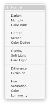
2. Let us switch the blending mode with a shortcut
It would be great to be able to cycle through blending modes quickly.
- Click on the dropdown
- Choose the blending mode
- Click, close the dropdown and see the result.
- Want to change it? Repeat for the 16 blending modes 😡
3. Give us an option to hide a symbol element by default
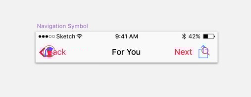
As our project progresses, we build more and more advanced symbol instances. Let’s consider a basic iOS Navigation Bar.
This is our base symbol:
An example of a flexible symbol.
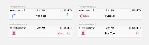
It let us create the following instances (by simply turning on and off the elements):
Problem:
Let’s assume that we have 40 instances like that in the project. During the design iteration we discover that we need to add another element to that symbol, which will be visible only in some specific new screens:
We added a new element to the symbol
Adding a new element will affect ALL the 40 instances:
The new element was added to all of the instances, which ruins the project a bit ;)
Solution:
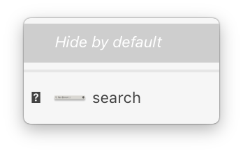
Since it is better to hide that new element in one base symbol than to look for it in 40 instances, it would be great to have that option (hide by default) in the base symbol.
4. Option for assigning a shortcut for “Set to Original Size” (symbol)
Problem:
Imagine that you have 20 instances of a symbol. Then you decide to change the symbol’s artboard size a bit. This usually messes up the symbol instances, so you have to go one by one, RMC, go to the very bottom of the dropdown options and choose “Set to Original Size”.
It would be a lot easier to assign a keyboard shortcut to this function. Funnily enough, there is an option like that in the menu, but it relates to Images: Layer/Image/Set to Original Size. Unfortunately, this doesn’t work for symbols.
Solution: Make it unified, e.g. Layer/Object/Set to Original Size. That would work for both symbols and images (then we will be able assign a shortcut for that 😎)
5. Multiple nudge modifiers
Simply: let us assign more nudge modifiers (except Shift for x10). Eg. Shift+Fn for x100 multiplier. It would be great to set our own nudge values. There are plugins for that though.
6. Add cmd+letter shortcuts in dialog boxes:
The cmd+D and cmd+C doesn’t work ☹️
Most software utilizes this simple trick, making the life of millions of people easier. I was a bit disappointed that Sketch is missing this simple feature, but as I can see, it happens even to the best 😉.
7. Spacebar for moving a created patch point
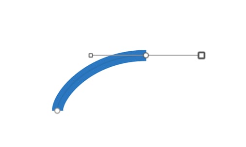
What if you want to change the position of the created point?
Adobe sets a better example here as well. In Adobe’s software, we can easily change the placement of a freshly created point by holding the spacebar (while still having the LMB pressed). It would be great to have the same flexibility while working with paths in Sketch.
8. Let us decide how we want our symbols to scale
Currently, if we want to scale a symbol, the only option is to stretch it with a drag of the mouse or use size inputs. We can’t use the scale dialog, so this means that we are left without the option of scaling a symbol proportionately (with proportional fonts sizes and so on).
That would be all for now. I hope that other designers will relate to these ideas — please let me know what do you think in the comments! I also hope that the Bohemian Coding team will find this useful. I might have a guess they are already working on some of the problems, as they seem to be close to the community. Perhaps, the solutions and implementations will surprise us — as usual — in a positive way! I can’t wait to see what the next versions of Sketch will look like and I keep my fingers crossed for them. Peace ✌️


.jpg?width=384&height=202&name=10%20Tips%20for%20Stunning%20%20Dark%20Mode%20Design%20(1).jpg)


.jpg?width=384&height=202&name=Orbem%20website%20on%20a%20laptop%20(1).jpg)


