Importance of a Style Guide in Frontend Development


Nowadays, it’s typical not to design full pages but to create a system of elements and components instead that can be connected to build a page or shareable partial, which can also be referred to as a component. Using this workflow lets us create a flexible, logical and consistent interface system that can be described with a style guide.
What is a frontend style guide?
You probably know something called a branding style guide, but this does not have much in common with frontend style guides. The former is mostly about logo variations, usage rules, and brand's color palette or typography. The frontend style guide, on the other hand, is a visually represented collection of described UI elements that’s accessible in an easy and clear way and is specific for particular application(s).
Those elements can not only be components like input fields, panels or navigations, but also colors or even spacings. In this example, you can see the Buttons section from Netguru’s style guide for netguru.co:

As you can see, we have a few variations of the button component: full color, outlined, and greyed out, which is less prominent. Each variation also has its hover state described in the style guide. Such collections offer many advantages for both designers and frontend developers. For example, a designer could work more efficiently and be more consistent by picking those already created elements to build pages or bigger components. A developer that’s new to the project could quickly learn what components have already been created and how they should be used.
Living style guides
Living frontend style guides are websites which represent your components using the actual code that will be also used in production. The major benefit of it is that the style guide is always consistent with the code. Then, if you need to change the style of any component, you just update those in the style guide and all of the elements on a website are changed consistently.
Of course, you still need a designer who will update the Sketch or Photoshop template that contains all the elements of a living style guide.
What should a perfect frontend style guide contain?
Every project is different and is made of other elements, so there’s no simple answer to this question, but there are some “golden rules” for popular applications, which will make your style guide more usable and worthy.
Color palette
Having a color palette in the style guide helps designers create more logical and visually consistent elements that will fit components existing before, because you wouldn’t use new colors unless you really need them. It also makes it very easy for developers to create a list of color variables that will be used in CSS to keep the code DRY. In this example, you can see the Color schemes section from Netguru’s style guide for netguru.co:

Typography
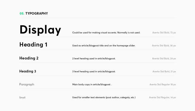
Most applications are about consuming and sending data, mostly text data, so it’s pretty important to include the information about used typography. The best way to present such information would not only include the visual aspects such as colors, font-weights, and line-heights, but also the context that a particular font style should be used in, the Typography section from Netguru’s style guide for netguru.co is a perfect example of this:
Forms
Forms can be really hard to manage in a frontend with a poor codebase. Many times, I’ve seen a combination of Bootstrap and custom styles for forms. Usually, there were also many variants for every input that only half of them were actually used. This can happen when you have no style guide for forms, and every form looks different.
Imagine that on some designs there are inputs with a 6px vertical padding, and on another design, there’s an input with an 8px vertical padding. Let’s assume that it happened because a designer wasn’t precise, and those inputs should actually look the same. A frontend engineer would probably create styles for both of them, doing away with the unnecessary code for the additional variant of input and inconsistent designs. Imagine what the creation of those designs would look like if a style guide existed – a designer would go to the Forms section of a style guide, and if the input they needed existed there, then they would copy-paste it. The effect would be consistent designs and a simpler codebase. Unless there’s no input fit for the designer’s needs, because then they would need to create a new variant of input and add it to the style guide.
Here you can see the Forms section from Netguru’s style guide for netguru.co:

Components
Our style guide should, of course, contain a list of already created and made available components that we could use for designing pages and other components and those components could serve nearly any purpose, for example:
-
Alerts
-
Accordions
-
Badges
-
Breadcrumbs
-
Carousels
-
Forms
-
Modals
-
Navigations
-
Progress bars
-
Tooltips
Ideally, every component should have a specification including instructions for correct implementation, a code snippet and, of course, a visualization.
Navigation with table of contents
If you have many components in your style guide, it might become harder to find the one that you need and manage them, and this is where a living frontend style guide comes in.
As we have already mentioned, living frontend style guides have many benefits. One of the benefits is the ease of creating the navigation for them (it’s not a graphic file, but a real website made with web technologies) to make them manageable and easily searchable.
Major benefits of using a style guide
We’ve already told about a few advantages of having a frontend style guide, but nowadays, most style guides are living style guides, and we also recommend that you use those. Let’s see the benefits of using living style guides:
UI interfaces are consistent and logical, but still flexible.
When you can see all elements together, it’s easy to notice something that’s inconsistent and should be changed/removed or to add a new element that’s visually compatible with the rest.
Components are easier and faster to test
You can include combinations of your components in your style guide, and each time you change one of the components, you can quickly see if any of combinations look broken.
Your codebase will be cleaner
This is rather a benefit of taking the atomic design approach, but this is what a style guide forces you to – writing modular, DRY code.
It will be easy to spot redundant code for components that are not used
When you go to your style guide and see that there are components that you haven’t seen on your website/app for a long time, then there’s a large probability that you don’t need them and can remove them to save some bandwidth.
It will be easy to spot inconsistencies in UI elements and components
It works especially if you have some bigger combinations of components in your style guide. There are situations that you change some component’s styles, and it looks pretty good on its own, but in conjunction with other elements, it’s not the same. With a well-written style guide, you can easily spot inconsistencies before deployment.
Introducing a project to a new frontend developer or designer will be a breeze
Each time that a new frontend developer or a designer is engaged in the project, they have to spend some time on understanding what’s going on in the project, what has already been created, and how the pieces work together. Looking into a style guide can speed up this process a lot.
You will estimate the creation of new pages or components quickly
Estimations will be easier because developers/designers/featured-clients (everybody benefits!) can quickly check which components have already been created and which haven’t when they’re planning a new feature.
A living style guide provides a single source of truth about the appearance of components
This one applies only to living style guides, where the code for creating components in a style guide and on a production server is exactly the same.
Conclusion
Having a frontend style guide, especially a living style guide, brings a number of benefits to designers and frontend developers, making their work much more efficient at very little cost – the cost is defining and updating the guide. What we get is a cleaner codebase, reduced probability of bugs occurring, and more efficient work of both designers and frontend developers. Engineers are not the only people who will benefit from a style guide – project managers and clients will also be happy to have it, since estimating processes will be much easier, when you can see all created components in one list and check what has already been done and what hasn’t.


