What is Material Design and Why Should You Use It in 2024?

Material Design (MD) has been around since 2014. Over the next decade, the design system's popularity will rise to become one of the top ready-made open-source systems designers and developers use. Its goal is to preserve consistency, facilitate teamwork, and speed up the whole implementation process.
Have you ever considered implementing Material Design into your project but couldn't convince your team? Here are several arguments for using MD that you could use to convince your team to use this design system next.
What is Material Design?
Material Design is a design system developed by Google. It is a visual guide for motion and interactions that can be customized and delivered across various devices and platforms.
The initial inspiration for creating the Material Design system was the card-based layout used by Google now.
Principles of Material Design
Material Design presents the following specific design guidelines that many designers recognize in this system.
- Skeuomorphic Design: Material is a metaphor – the Material Design surface is designed to resemble the mediums of paper and ink. It should be perceived as a digitization of the physical world. The inspiration includes manners of reflections, shadows, and texture presentations.
- Bold, graphic, intentional: Following the inspirations taken from the physical world, Material Design follows print design methods. Immersing viewers in the experience is provided by creating a visual hierarchy with typography, grids, spacing, and colors.
- Motion follows meaning: Providing motion in a Material Design helps to implement a finalized interaction and interactive experience. Motion maintains consistency and continuity through fully implemented user interactions.
Components and patterns
MD provides a comprehensive library of components that cover usage, behavior, and specification for each pattern. Creating a user interface is easy and prone to essential gaps: all system states are implemented in libraries and ready to use. Many elements are available, such as material icons and symbols for display, navigation, inputs, actions, and communication to the user.
Wrapped in extensive documentation, it becomes an invaluable companion for both designers and developers. Think of it like the well-established design patterns you find in magazines – each section uniquely defined, blending layouts, fonts, and colors harmoniously. Now, imagine this concept seamlessly transitioning into the digital realm, where designers across diverse industries are weaving their creativity into pattern libraries within complex systems.
It's a dynamic dance, navigating the delicate interplay between software design patterns and front-end codebases. The evolution of design patterns, often sprouting at the component and interactions level, invites designers to stay agile and in sync with the exciting roadmap of product development. It ensures design to stay not just functional but also user-centric.
Theming
Material Design enables Theming. This means the system can be customized to match brand guidelines and address its visual feeling via a digital interface. Colors, typography, and shapes are the main elements behind Material Design's Theming. Here are critical reminders for each part:
- Across each component, colors should be organized according to priority. With a color palette in mind, your overall design will be easier to adjust without the fear of creating a visual mess.
- Typography establishes visual hierarchies and sets the tone for the overall branding. There are 13 styles of typefaces, with each defined according to its meaning. Matching the typeface to our message becomes quicker and easier when keeping the theme in mind.
- Shapes can be adjusted and categorized by size, from smallest to largest. From here, size consistency can be supported thanks to the inherited values assigned to each category.
7 reasons to use Material Design: Why is it useful?
Understanding the basic principles of Material Design is one thing, but convincing your team to employ this system is another. We've outlined some convincing arguments that support the shift towards a Material Design system.
Speed
Material Design is a ready-to-use design system with endless documentation, community anecdotes, and a list of actual states and patterns that speed up the design process. Starting with a ready library of assets and elements speeds up the work of design teams. These assets also help developers implement interfaces faster.
As experienced developers will already have well-developed elements of Material Design from their previous projects, they should have a clear understanding of what the current design team is trying to portray and how to execute design plans.
Mobile-first design system
Since over 50% of the global population only access the internet from their smartphones, a mobile-first design approach improves the probability of your product's mass adoption. To support this transition to a mobile-first approach, MD could be employed.
MD is one of the most compatible design systems for mobile apps. It helps create high-quality, efficient, and interactive applications in a shorter amount of time. After all, the original purpose of Material Design was to develop a consistent system for Android apps.
Flexibility & cost optimization
As the famous saying goes, "Time is money." Material Design is a flexible design system that allows fast theme customization. The document resources contain explanations, instructions, and guiding principles for every Material Design element. You can also find screen implementation examples for the developer to follow.
Should changes be necessary, the customization tool allows designers to adjust the application themes and styling depending on the brand guidelines. Design kits were made readily available for designers on popular programs like Figma, Adobe, and Sketch.
Everything from material icons to more complicated components is made accessible and editable through these kits. This comprehensive design system's ability to adapt quickly and reconfigure existing designs is a huge advantage.
Consistency
Thanks to the atomic approach and list of elements that inherit styles from one another, we can safely keep our designs consistent. An interface that shows character through its visuality and interactivity is proof of a high-quality design service.
Our chosen web font will also be more user-friendly thanks to its cleanliness. Google fonts, after all, are known for their smooth reading experience and compatibility with other sans serif fonts.
Performance
Material is a design system created to help teams build high-quality digital experiences for Android, iOS, Flutter, and the web.
A well-implemented library of patterns and interactive behaviors ensures that MD-implement products work quickly and efficiently. Because performance is a crucial user experience factor, MD components can help retain users and improve overall engagement.
Maintenance, Updates, & MD3
The Material Design guide is under constant revision and improvement. For example, the new documentation for Material Design 3 (MD3) was recently published with rich documentation that supports fast onboarding and deeply explains interactions, behaviors, dependencies, and usage that facilitate the development of aesthetic, functional products.
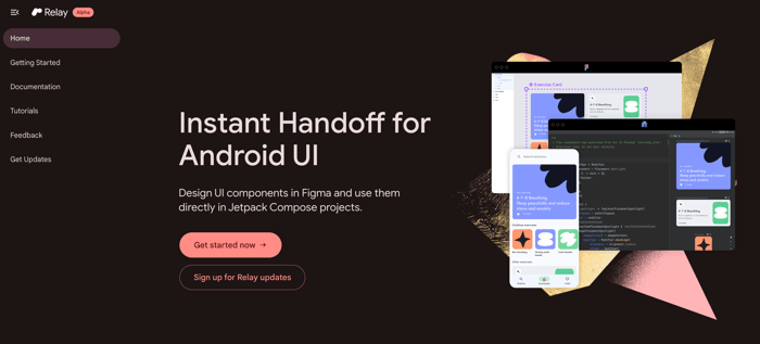
Relay is a new design-to-code workflow for Android UI, and the toolkit launched in alpha at the Android Dev Summit ’22.
This well-prepared documentation means developers can use even the latest version of Material Design right away, making it one of the more developer-friendly systems of today. Once released, the only task is to keep the product up-to-date and bug-free. Resolving these issues is a long-term process that usually involves new developments being onboarded every few months.
From a deadlines and management perspective, efficiency, well-kept documentation, and 24/7 maintenance support are all advantages of the Material Design system.
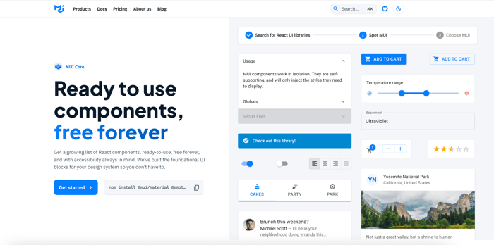
A ready-to use library of React components to implement in Material Design.
Using Material Design for your application
We've outlined the positive aspects of using Material Design for your project. Material symbols and components are the driving principles behind creating beautiful, unified designs with which users would love to interact.
Material Design and its accessible components make your product more inclusive and broaden your target audience. One should consider the product's needs and the target audience's preferences. Using images, icons, fonts, and white space are all important considerations, especially when patterns come ready made.
With Google and Android's wide adoption, using the principles of Material Design will make your users feel at home with your product. A haptic, familiar, and intuitive interface will draw your audience in and keep them engaged with your application.


.jpg?width=384&height=202&name=10%20Tips%20for%20Stunning%20%20Dark%20Mode%20Design%20(1).jpg)


.jpg?width=384&height=202&name=Orbem%20website%20on%20a%20laptop%20(1).jpg)


